GOALS
Ensure key security actions are accessible with minimal taps on a small screen.
Prioritize clarity by surfacing only the most essential information at each step.
Design for touch with large, easy-to-press targets and clear visual feedback.
Adapt complex system controls into simplified, mobile-friendly flows.
Continuously refine based on real user behavior, pain points, and usability insights.
MY ROLE
Product Designer
Motion Designer
Tools
Figma
After Effect
Notes
Year
2024
REM35M
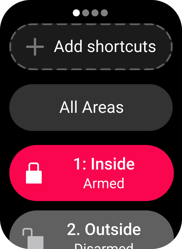
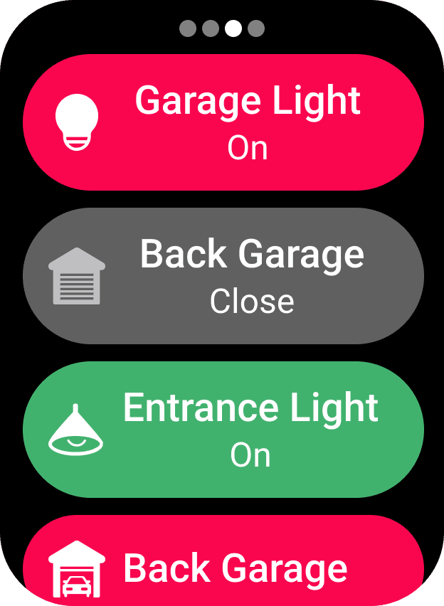
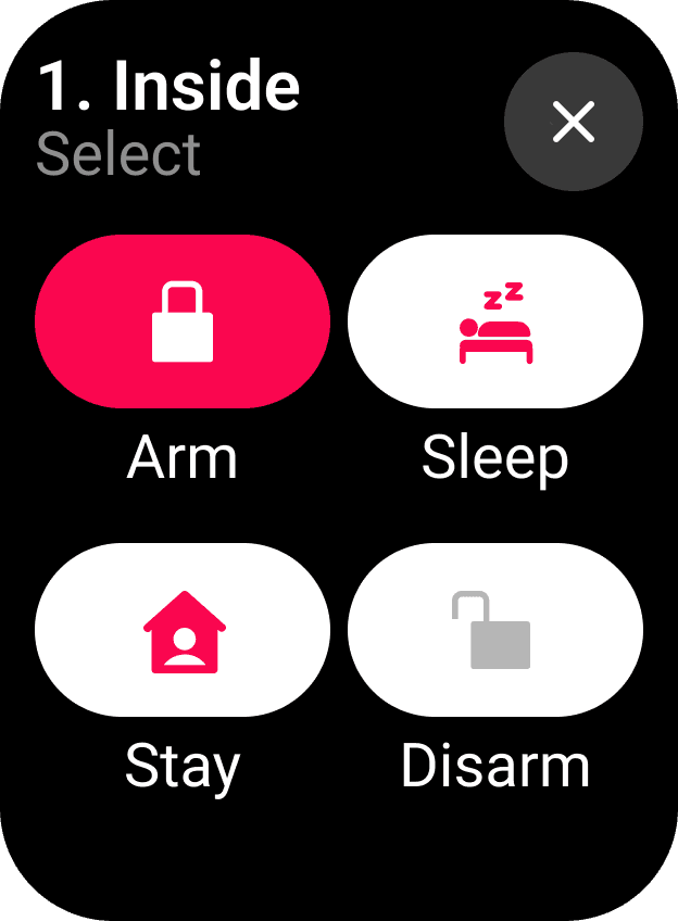
Compact security remote offers one-touch control to arm, disarm, trigger panic alerts, and manage individual zones with speed and simplicity.
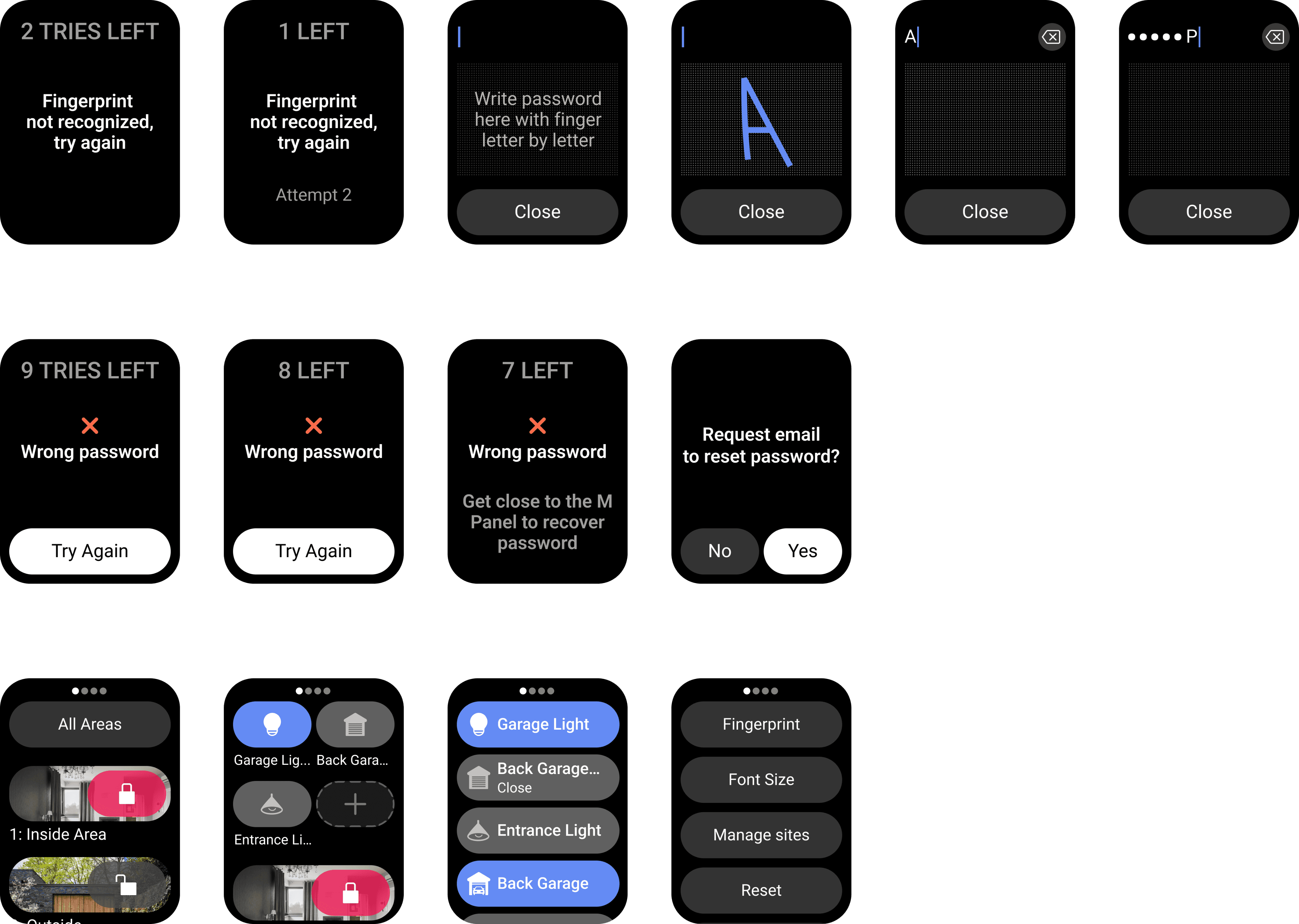
PROBLEM
Fitting the entire security system into a small screen limits visibility, causing navigation issues, missed details, and user frustration.
Key insights from remote development
• Early prototypes had too many buttons, leading to accidental presses and user confusion during testing.
• Adding LED indicators improved feedback and reduced uncertainty around system status (e.g., armed, disarmed, alert).
• Compact form factor required prioritizing essential functions—secondary features were moved to long-press or combo inputs.
• Iterations showed that icon-based labeling was more effective than text in conveying actions at a glance.
• Testing revealed the need for tactile differentiation between critical buttons (e.g., panic vs. arm/disarm).


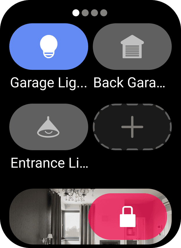

Physical Device
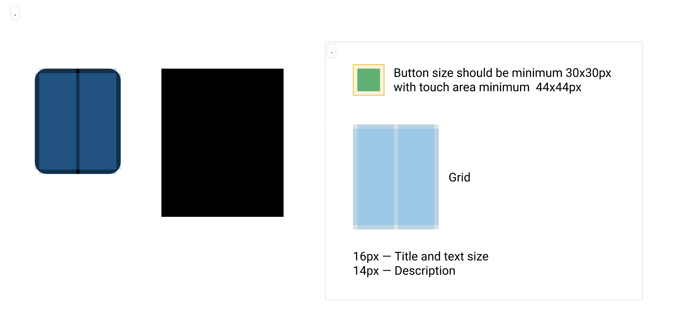
Grid
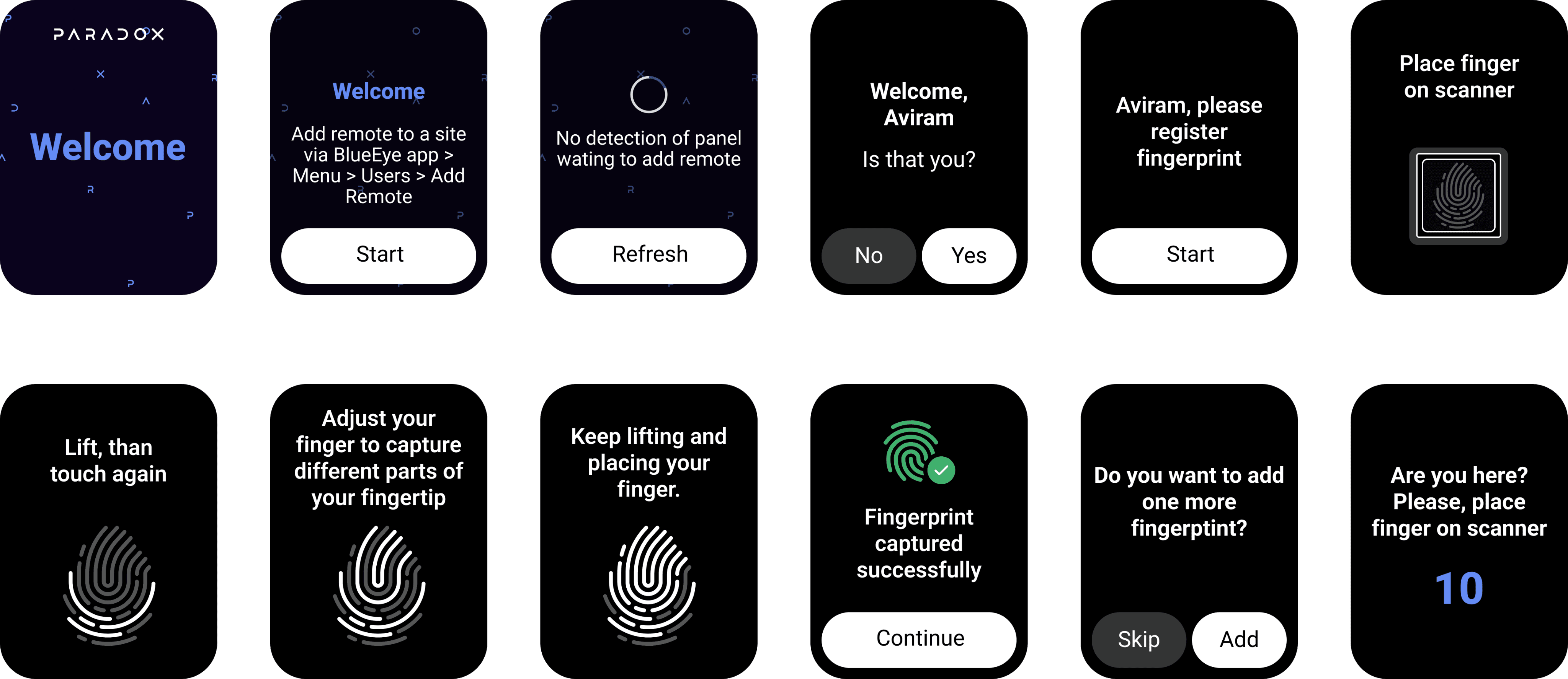
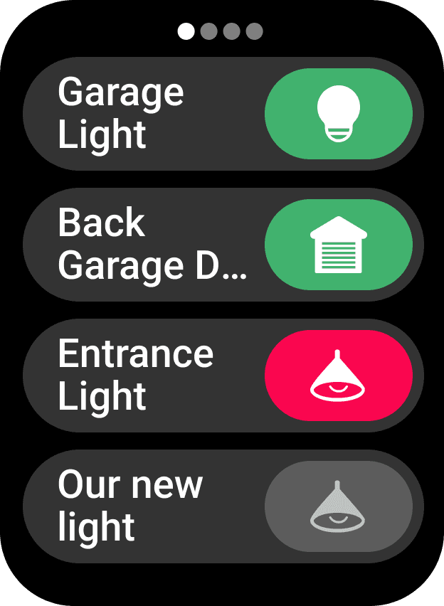
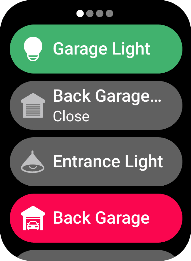
First Time - On-boarding
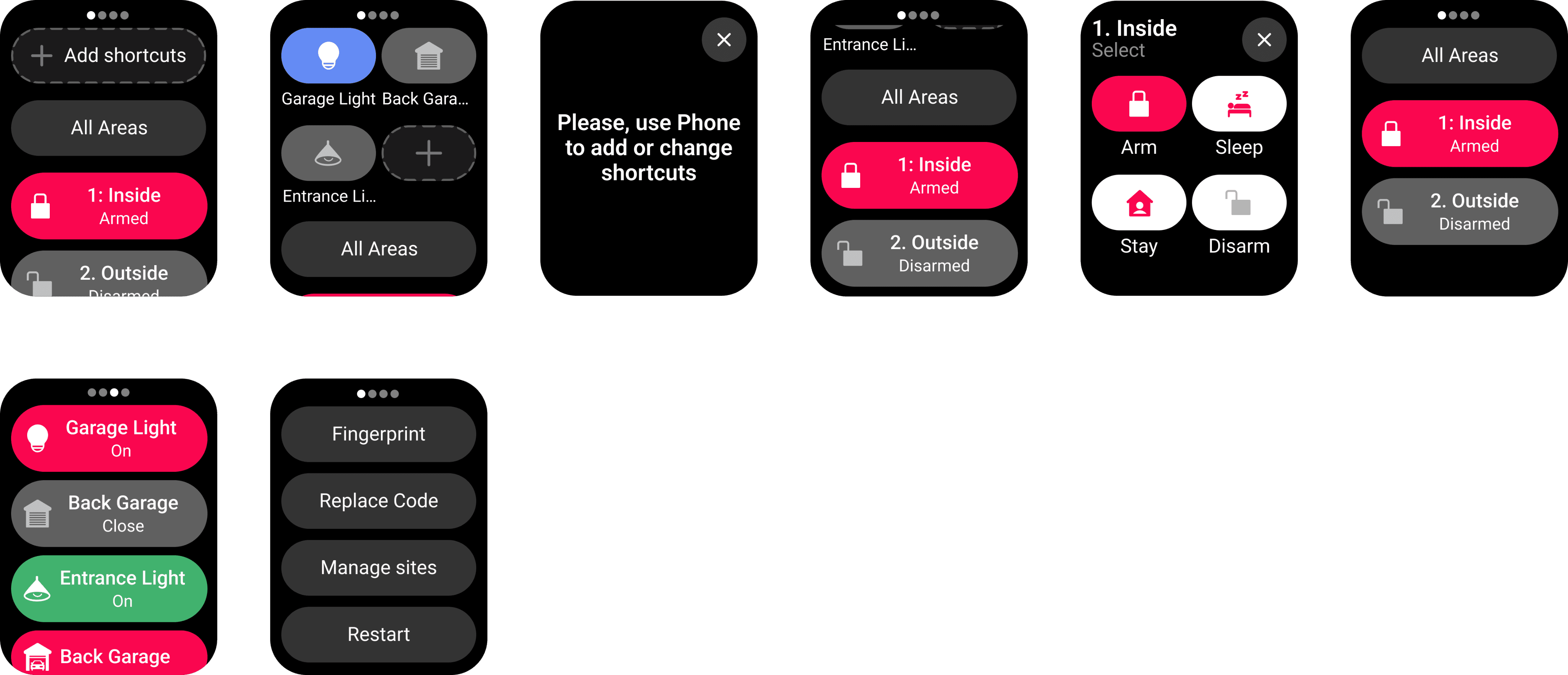
First Time - main screens
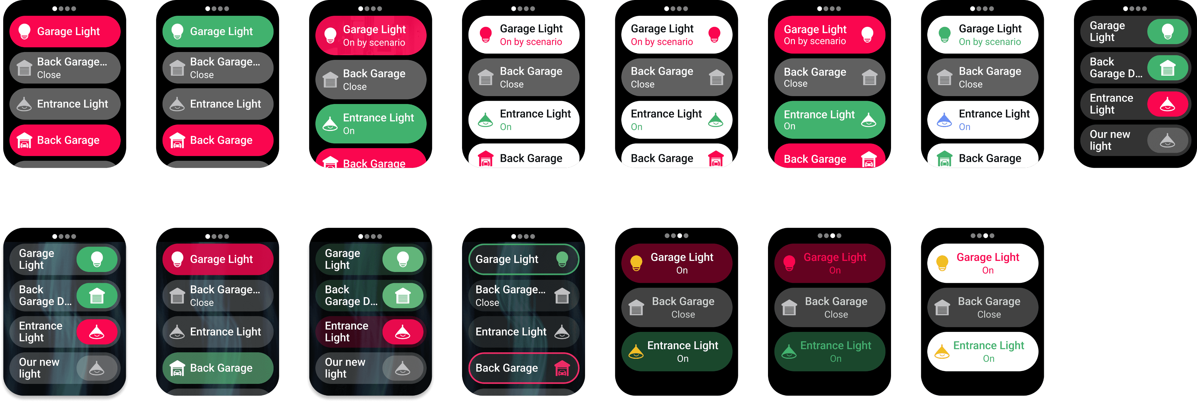
Outputs
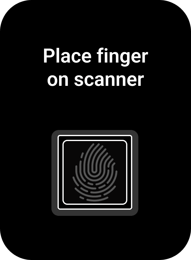
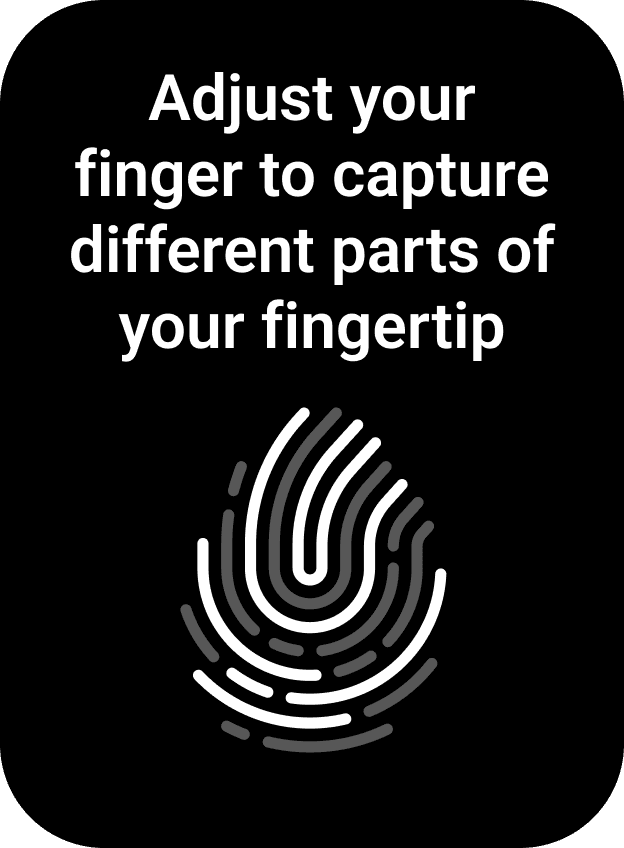
Second+ time - presenting finger on sensor
Retrospective
Reflecting on the remote design process helped surface valuable lessons around simplifying hardware interactions and balancing constraints. Here are a few takeaways from developing the security remote experience:
So, what went well?
• Iterative prototyping helped quickly test physical layout and eliminate unnecessary buttons.
• LED feedback and haptics added confidence to user actions without overloading the interface.
• Tight collaboration with engineering ensured that every design decision was grounded in hardware feasibility.
• Distilling complex system controls into just a few inputs felt like a major UX win.
What could improve next time?
• Earlier usability testing with non-technical users would have surfaced pain points sooner.
• Iconography clarity needed more refinement—some symbols were misinterpreted in early testing.
• Physical form factor limitations occasionally forced compromises that impacted flow clarity.