M Portal
Company Product
My Role
Product Designer
DESCRIPTION
Centralized platform streamlines user and site management, real-time monitoring, role assignment, and smart home control.
Tools
Figma
Notes
CONTEXT
Developed as a modern replacement for the outdated IPC10 receiver system, this platform centralizes user management, site control, and monitoring.
Year
2024

CHALLENGE
How might we design a tool that simplifies site and user management for installers, while remaining scalable and clear?
We were given the following goals and constraints:
Enable installers to manage users and sites from a centralized desktop platform
Make common tasks—like assigning roles or editing site
settings—fast and intuitive
Keep the UI flexible for future features, without complicating the current experience
CONSTRAINTS
M Portal was part of a broader effort to modernize our installer tools. While I wasn’t the only designer on the project, I was deeply involved in defining the UX patterns and interaction flows, especially around multi-site logic, role assignments, and permissions.
This wasn’t a redesign—it was a rethinking. The legacy systems were a patchwork of interfaces, each with different rules and visuals. Through research and internal feedback, we saw the need for a unified platform that could scale across teams, regions, and user types without becoming bloated.
The design process involved close collaboration with product, engineers, and field teams. I worked on wireframes, prototypes, and final UI—focused on keeping navigation clear and flows efficient, especially for users managing dozens of sites at once.
Over time, M Portal became the go-to tool for managing site access and user roles. While the feature set is still evolving, we laid the groundwork for a product that feels modern, reliable, and built for the way installers actually work.
RESEARCH
Interviews
Through user interviews with professional installers and internal stakeholders, our team identified the key friction points in the existing setup process. Most tools were either outdated, too fragmented, or required jumping between devices just to manage basic user and site information.
Installers wanted something faster, clearer, and more reliable—especially when working across multiple job sites with different access levels and user needs.
Key user stories
As an installer, I want to manage multiple sites from one place without switching between tools.
As an installer, I want to quickly add and remove users without losing track of their access levels.
As an installer, I want to see a clear overview of each site’s status and team members.
ITERATIONS
From Fragmented Tools to Centralized Portal
M Portal was designed to replace a scattered ecosystem of apps and processes. Our goal was to unify user and site management into one streamlined desktop experience.
The early iterations focused on a two-panel layout: a left-hand navigation for switching between sites, and a main content area for managing users and site settings. We tested flows for adding users, editing permissions, and toggling site access—refining each based on field feedback.
We also explored ways to future-proof the interface, making sure it could scale with more complex access roles, site types, and integrations. By the final iterations, we had a solid, scalable foundation for the core experience: clear roles, real-time status, and efficient multi-site control.
EARLY FEEDBACK
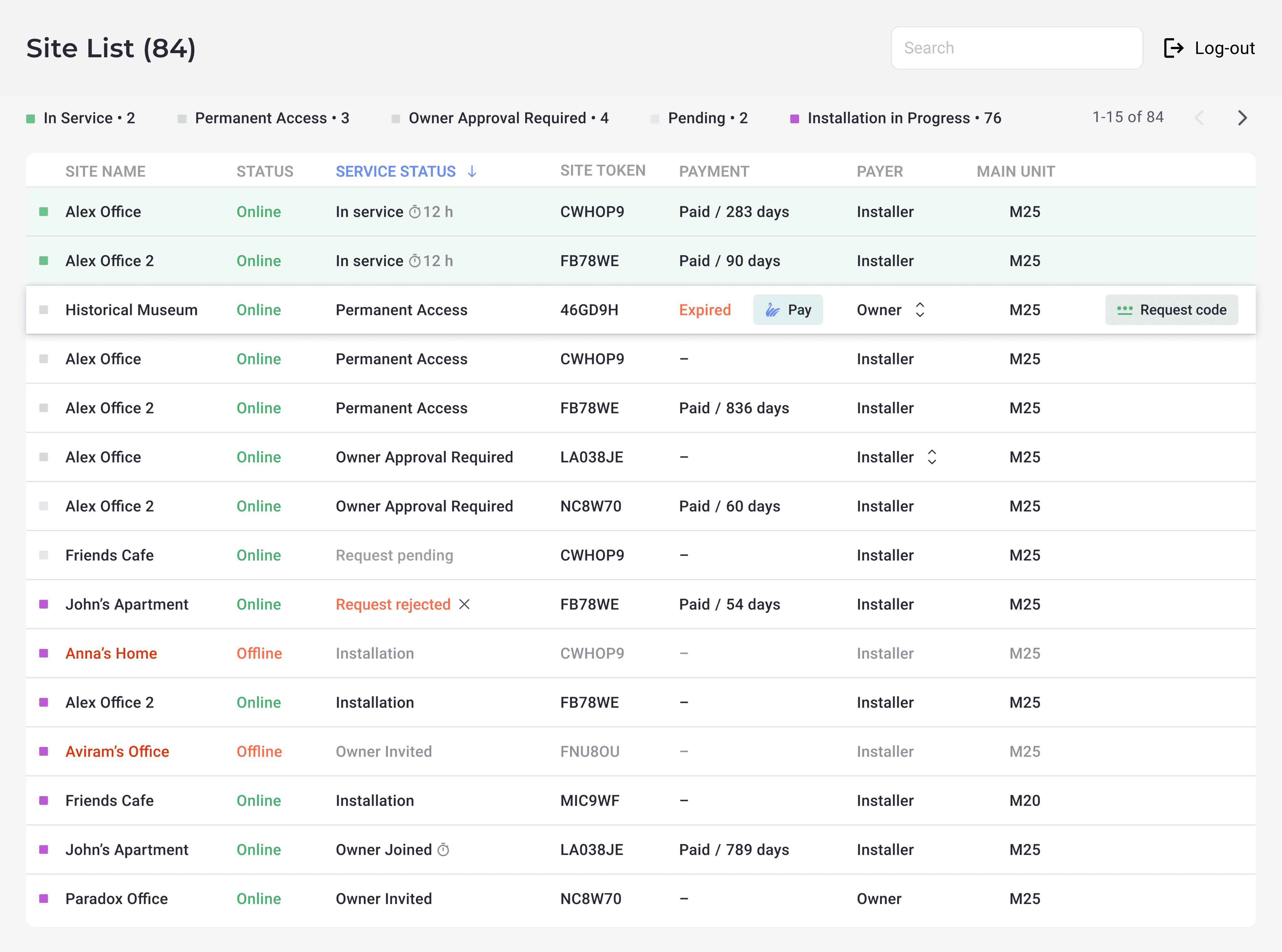
Feedback from early users of the Site List screen revealed that, while the data was comprehensive, the layout felt dense and overwhelming—especially for installers managing dozens of active sites. Many were unsure how to quickly interpret service states or locate actions like code requests and payment renewal.
Users also struggled with status meanings like “Owner Approval Required” or “Request Rejected,” which weren’t always clear in context. The differences between service status, site status, and online/offline indicators caused additional confusion.
This led us to refine both the information hierarchy and visual signals—prioritizing clarity for the most time-sensitive tasks. We introduced consistent color coding, hover tooltips, and inline actions (e.g. “Request code” and “Pay”) to make the interface faster to scan and easier to act on, even for new users.
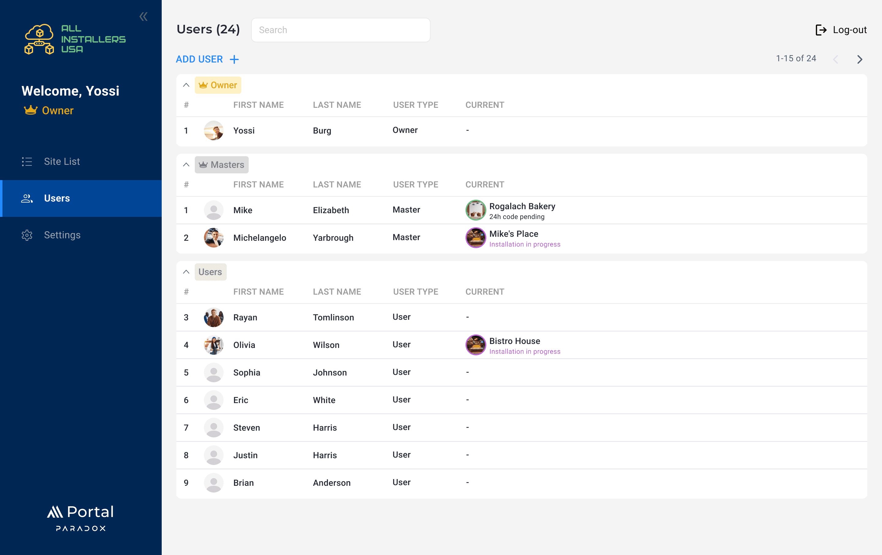
KEY FEATURES
Manage users across multiple sites
Create, edit, or remove users and assign roles instantly
Assign and control access levels
Set permission levels per user and per site—Installer, Owner, or Guest
Search and filter large site lists
Quickly locate a site or user with contextual search and smart filters
Monitor site status at a glance
Track service status, online/offline indicators, payment info, and request state in one unified view
A control panel for site and user management
With a clean, scalable interface, M Portal acts as a central hub for managing user access and site configuration. Built for installers, the layout supports fast navigation across dozens of projects while surfacing only what’s relevant in the moment.
Whether checking service status, resolving access requests, or generating tokens—installers can manage everything from one place without jumping between tools. It’s a modern control panel for the workflows that matter most.
MAIN SCREENS
UX Breakdown
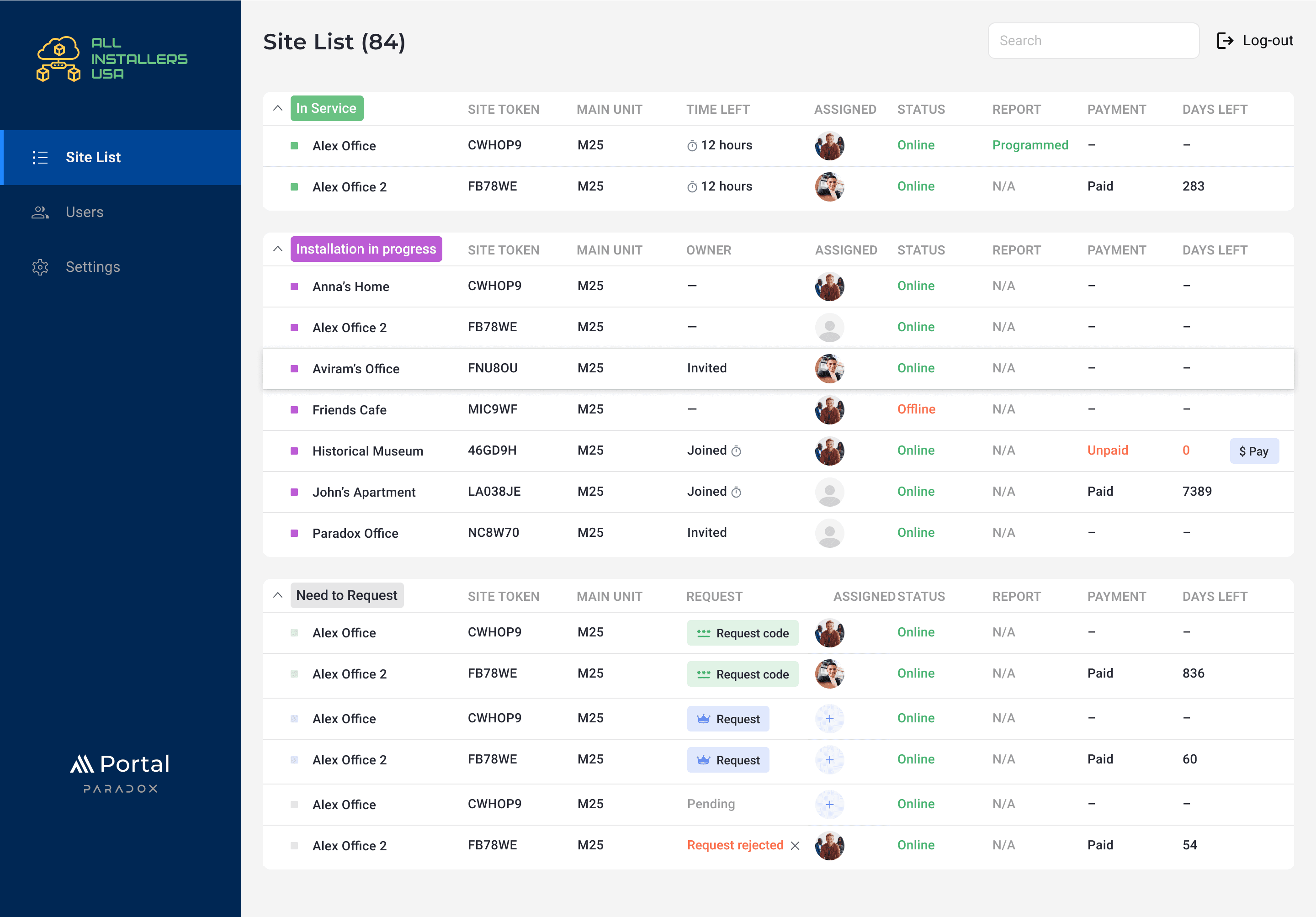
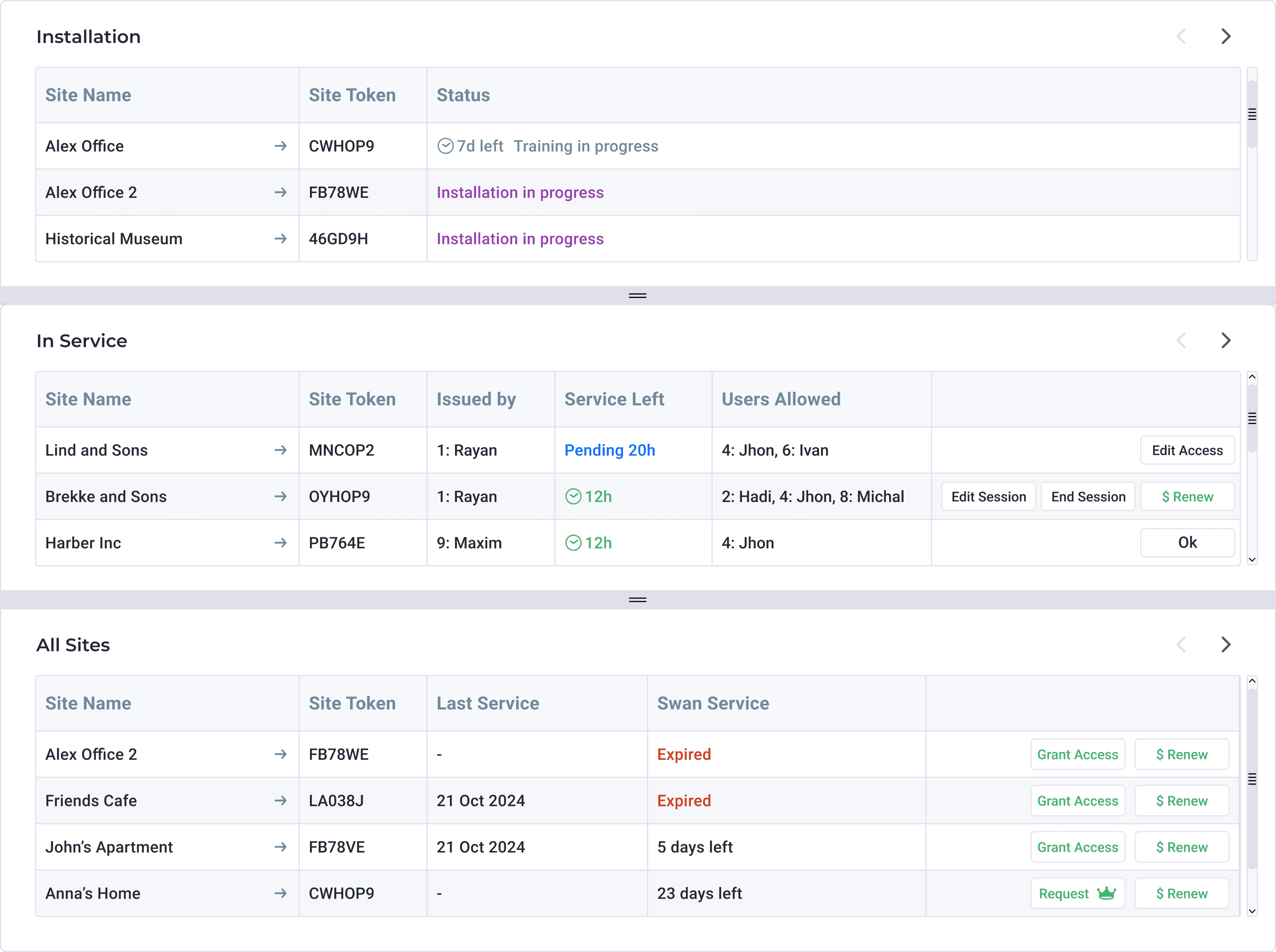
Section-Based Grouping
We split the view into logical service states:
Installation: Sites still in setup phase, with status cues like “Training in progress” and countdowns for remaining setup time.
In Service: Actively running sites, showing service time left, issued users, and live controls.
All Sites: A full overview with service history and Swan subscription status.
This hierarchy reduces cognitive load and mirrors how installers mentally sort projects: what’s being set up, what’s running, and what needs review.
UI Highlights
Actionable Table Rows:
Each row provides inline actions (e.g., Edit Session, Grant Access, Renew) to reduce navigation depth and support quick, in-context decisions.Status Indicators:
Service times use color (green, blue, red) for urgency and clarity, while tooltips and buttons adapt to site state (e.g., “Expired” vs “23 days left”).Token Visibility:
Site Tokens are always visible, supporting fast reference or copy/paste when setting up new users or configurations.User Management:
Allowed users are listed by role/ID for transparency, and controls like Edit Access make it easy to manage permissions on the fly.
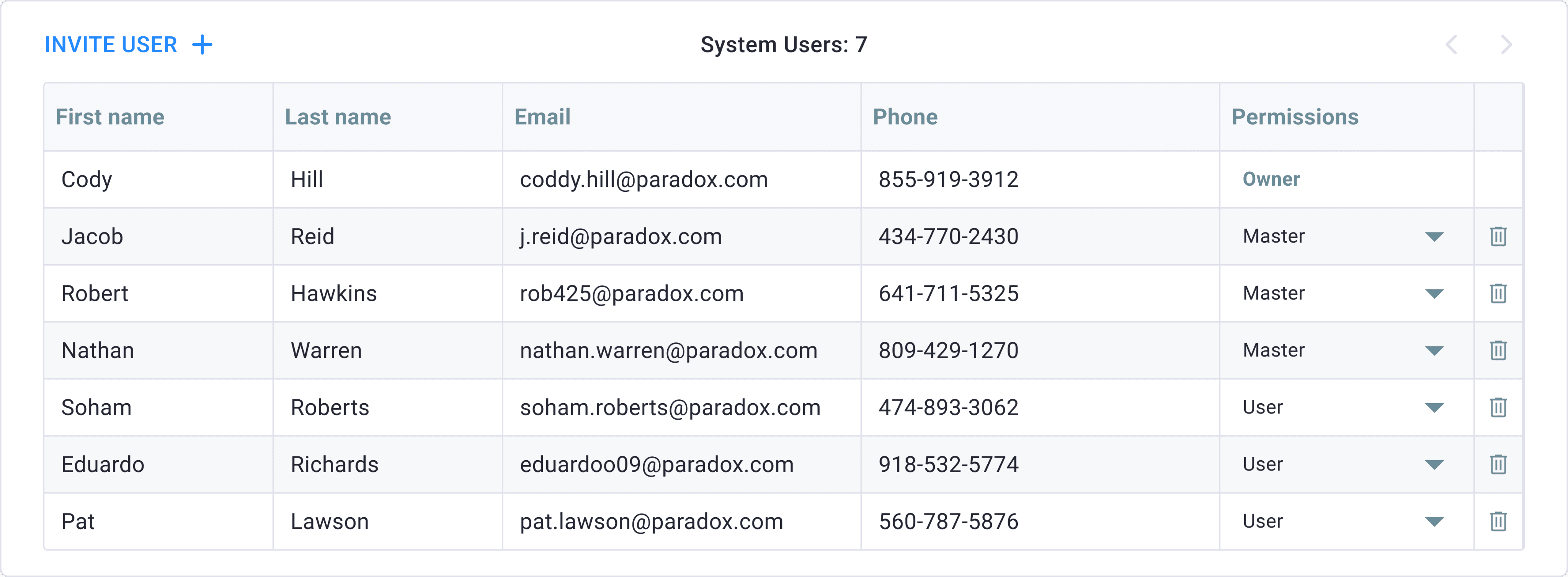
UX Breakdown
1. Structured User Table
The table format prioritizes essential fields—Name, Email, Phone, and Permissions—making it easy to scan and manage user data in one place.
2. Role Management at a Glance
The Permissions column uses a dropdown for quick role switching (e.g. User, Master, Owner). This ensures access levels are easily adjustable without leaving the screen.
3. Invite and Remove Actions
Invite User is placed prominently for quick onboarding.
Trash icons provide an immediate way to remove users, reinforcing administrative control while staying lightweight.
UI Highlights
Permission Colors: The "Owner" role is styled in green for visibility, reinforcing its unique level of authority.
Dropdown Menus: Inline role editors reduce clicks and page reloads, promoting efficiency during high-volume edits.
Pagination Arrows: Subtle navigation controls anticipate scalability and larger teams.
PAYMENT FLOW
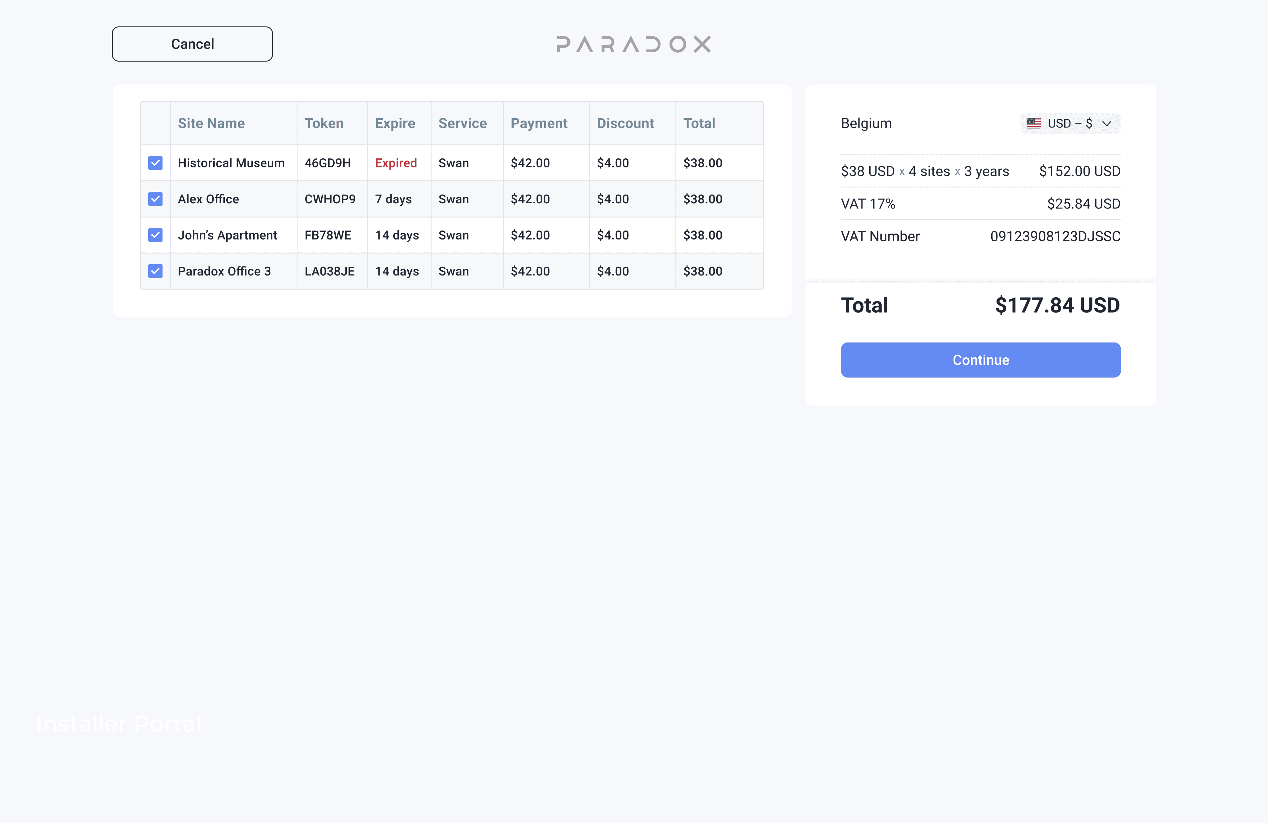
1. Site Selection
Users can select multiple sites with expiring service and see pricing breakdowns—including discounts and expiration dates—before checkout.
2. Billing & Payment
A clean two-step form collects billing info and lets users choose between credit card or PayPal. The right panel keeps total cost and VAT visible at all times for clarity.
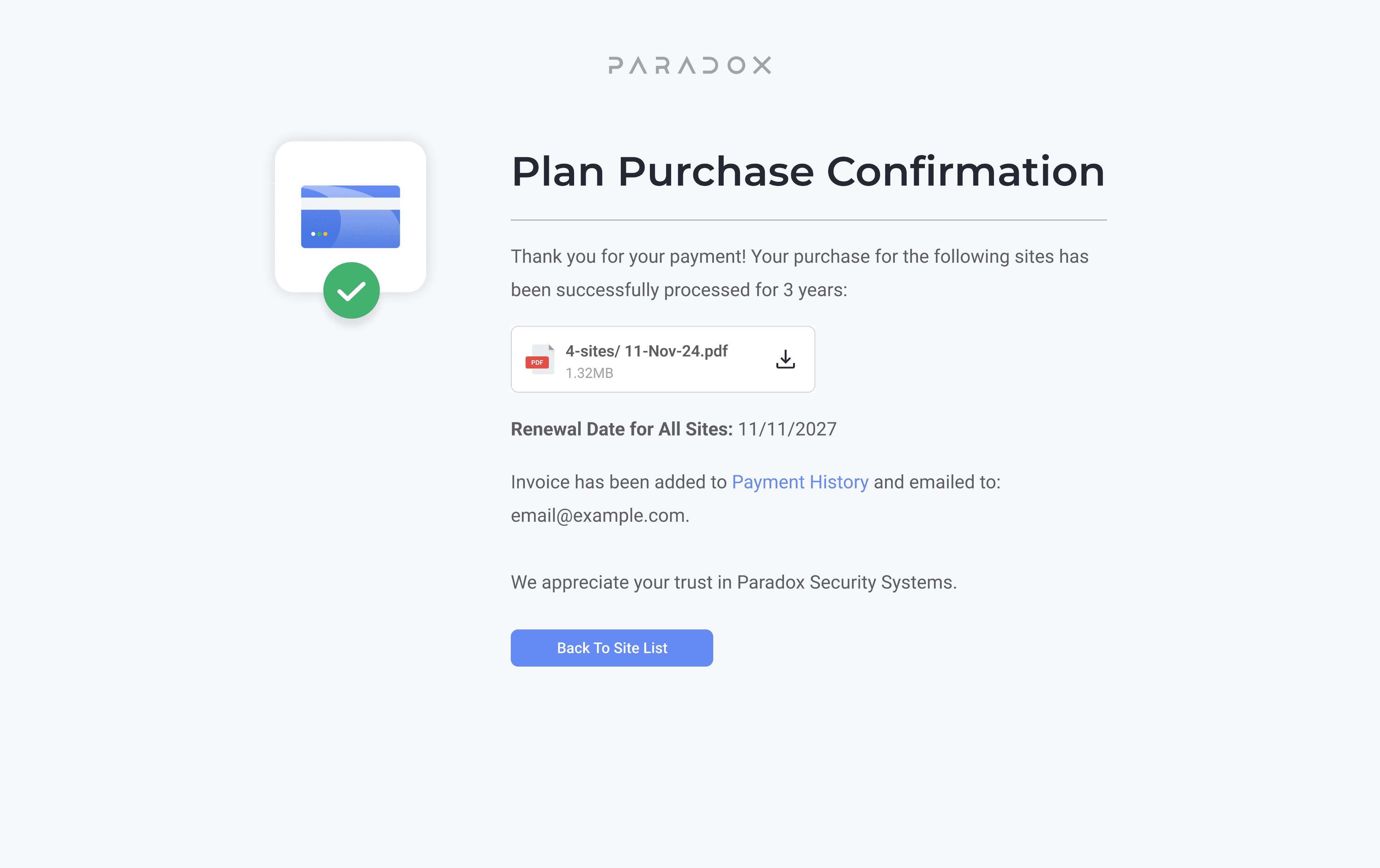
3. Confirmation
After payment, users receive a confirmation screen with invoice download, renewal date, and email receipt—providing immediate closure and trust.
Takeaway & Reflection
Before working on M Portal, I hadn’t spent much time thinking about how installers actually interact with security software in the field. Designing this platform pushed me to consider edge cases, real-world constraints, and what “efficiency” really means when you’re managing dozens of sites under pressure.
It also taught me that clean design isn’t just about aesthetics—it’s about reducing friction in high-stakes workflows. Clear roles, scalable structure, and surfacing the right actions at the right time made all the difference.
A final note: The best tools feel invisible. They get out of the way and let people do their job. That’s what we aimed for with M Portal—and it’s something I’ll carry forward.