PC Software
Company Product
My Role
Product Designer
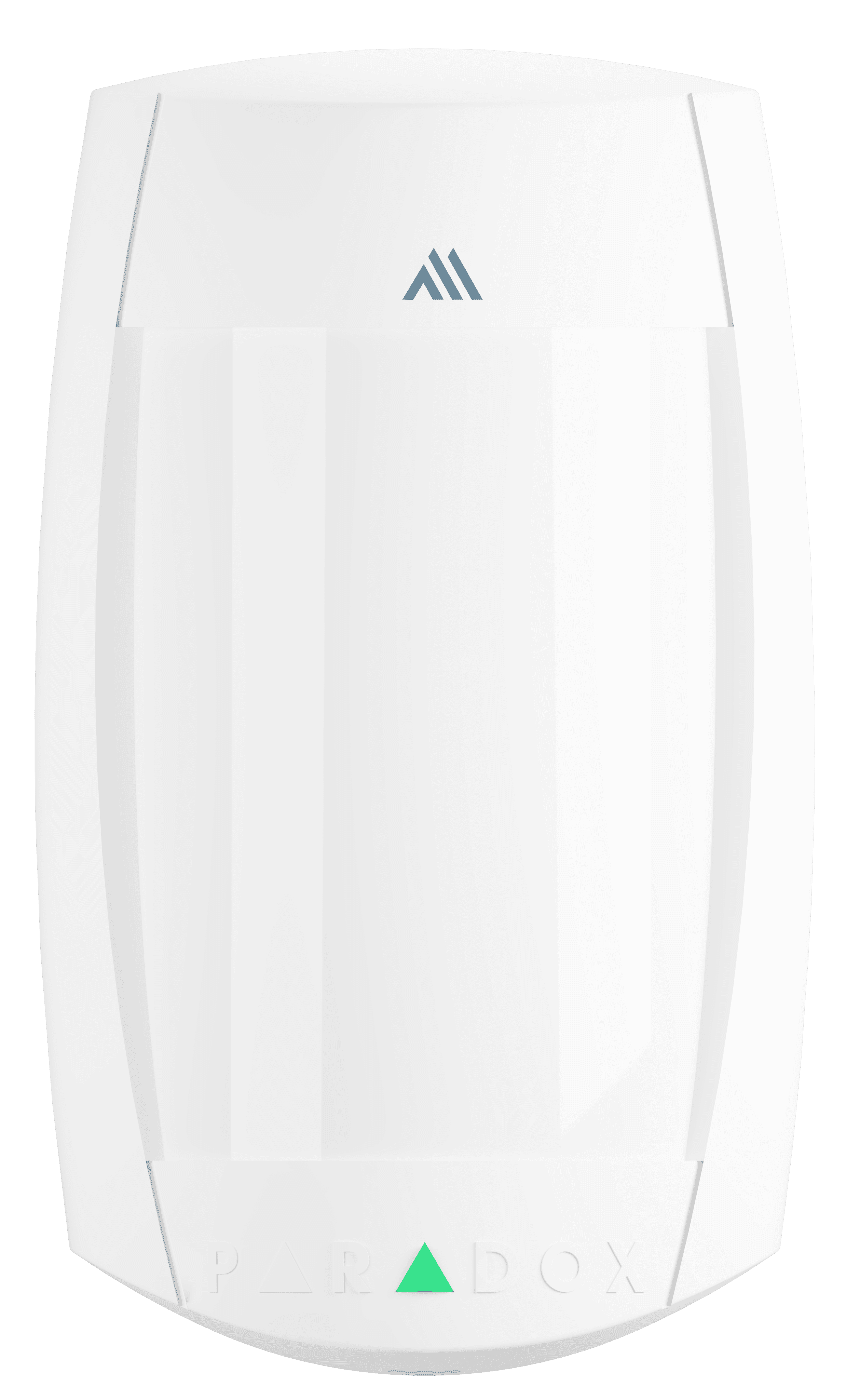
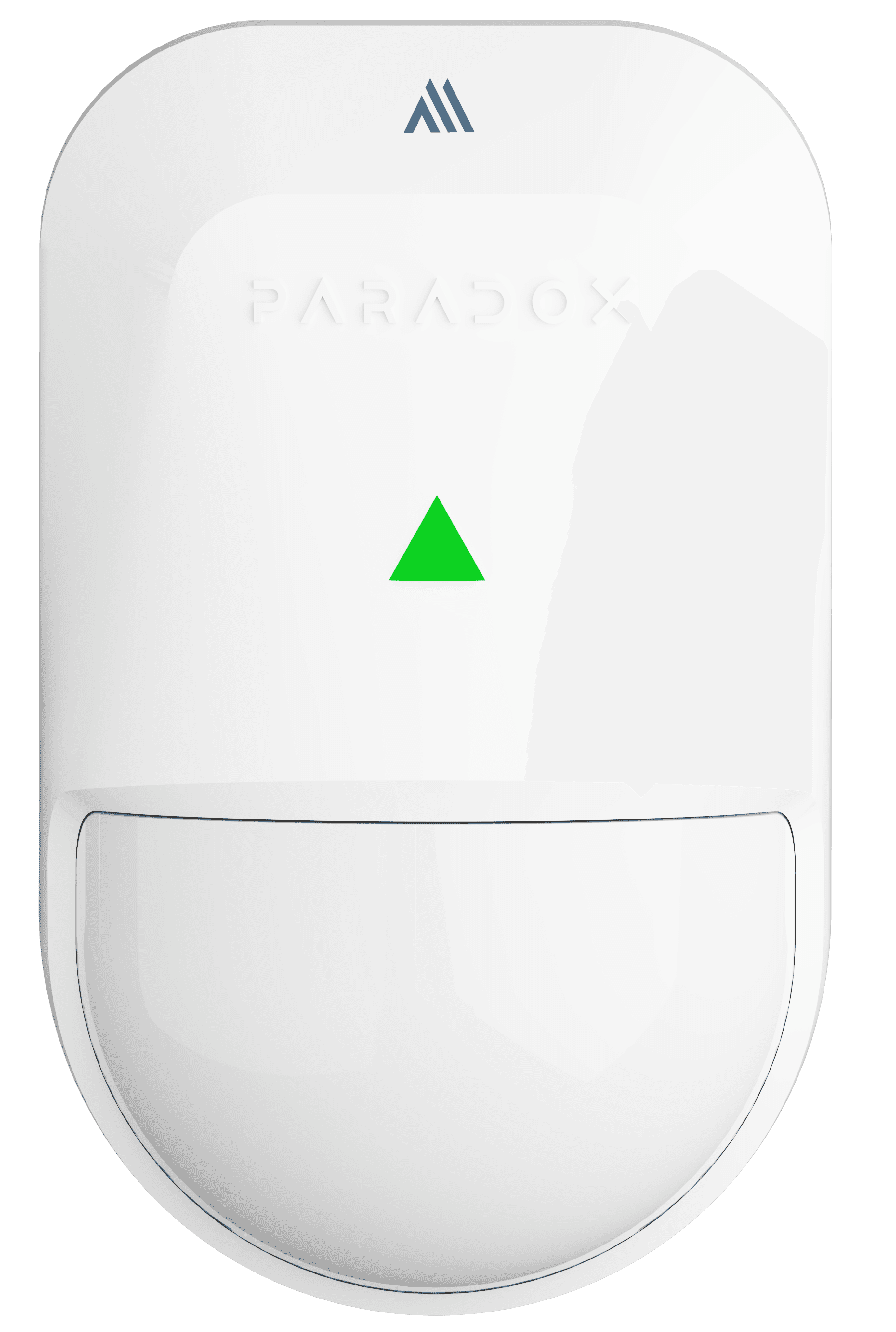
3D Modeling
DESCRIPTION
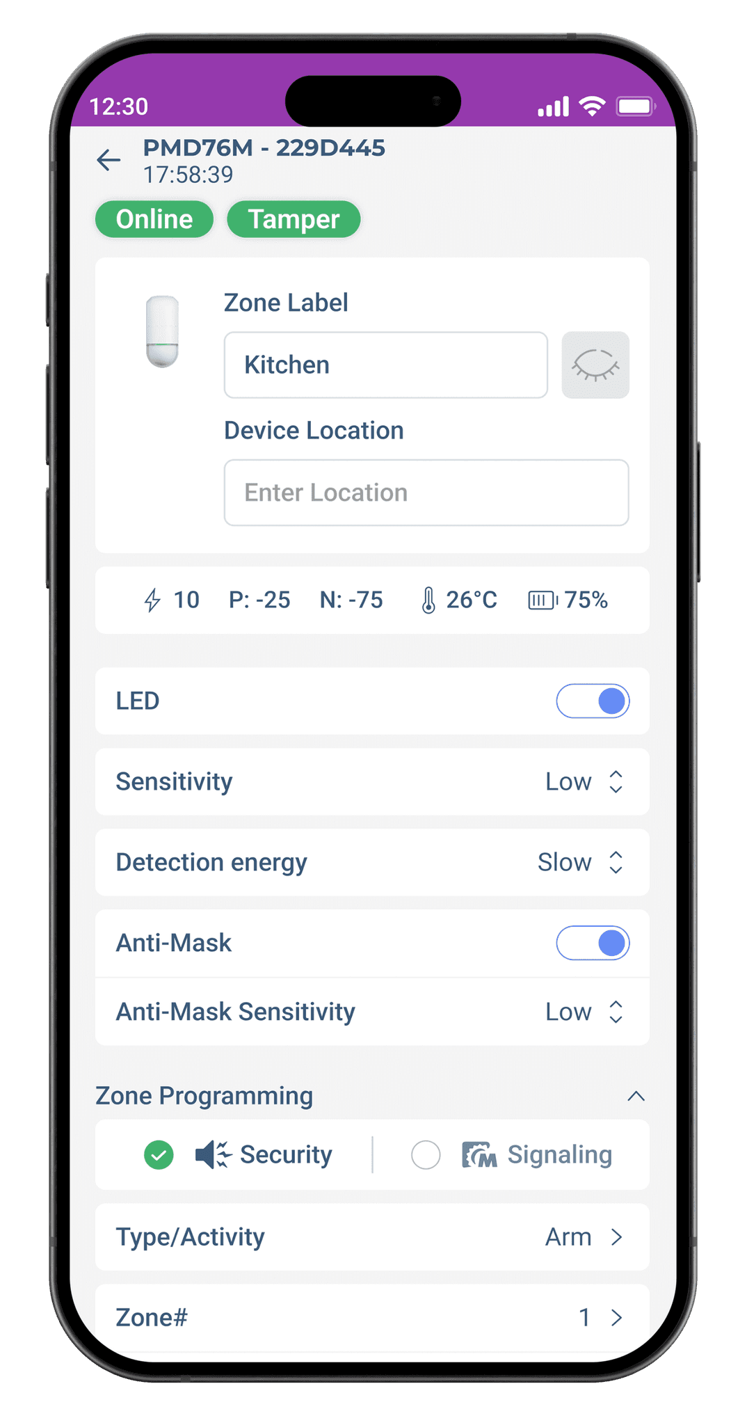
Smart home installer app, available on PC and mobile, streamlines secure system setup, control, and automation.
Tools
Figma
Blender
Notes
CONTEXT
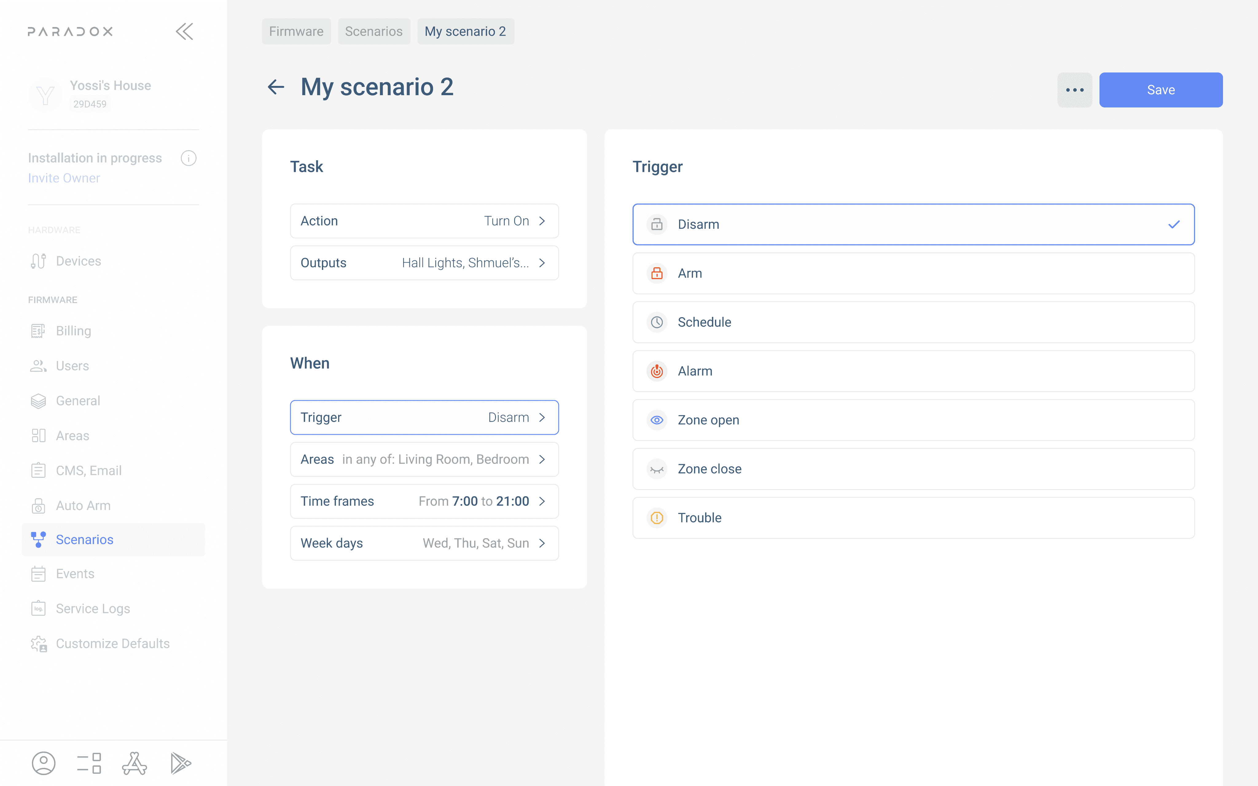
Built specifically for PC, the app was developed from installer feedback to streamline setup, reduce errors, and accelerate deployment.
Year
2023


CHALLENGE
How might we bring a mobile-first installer tool to desktop without losing speed, clarity, or simplicity?
I was given the following needs and constraints:
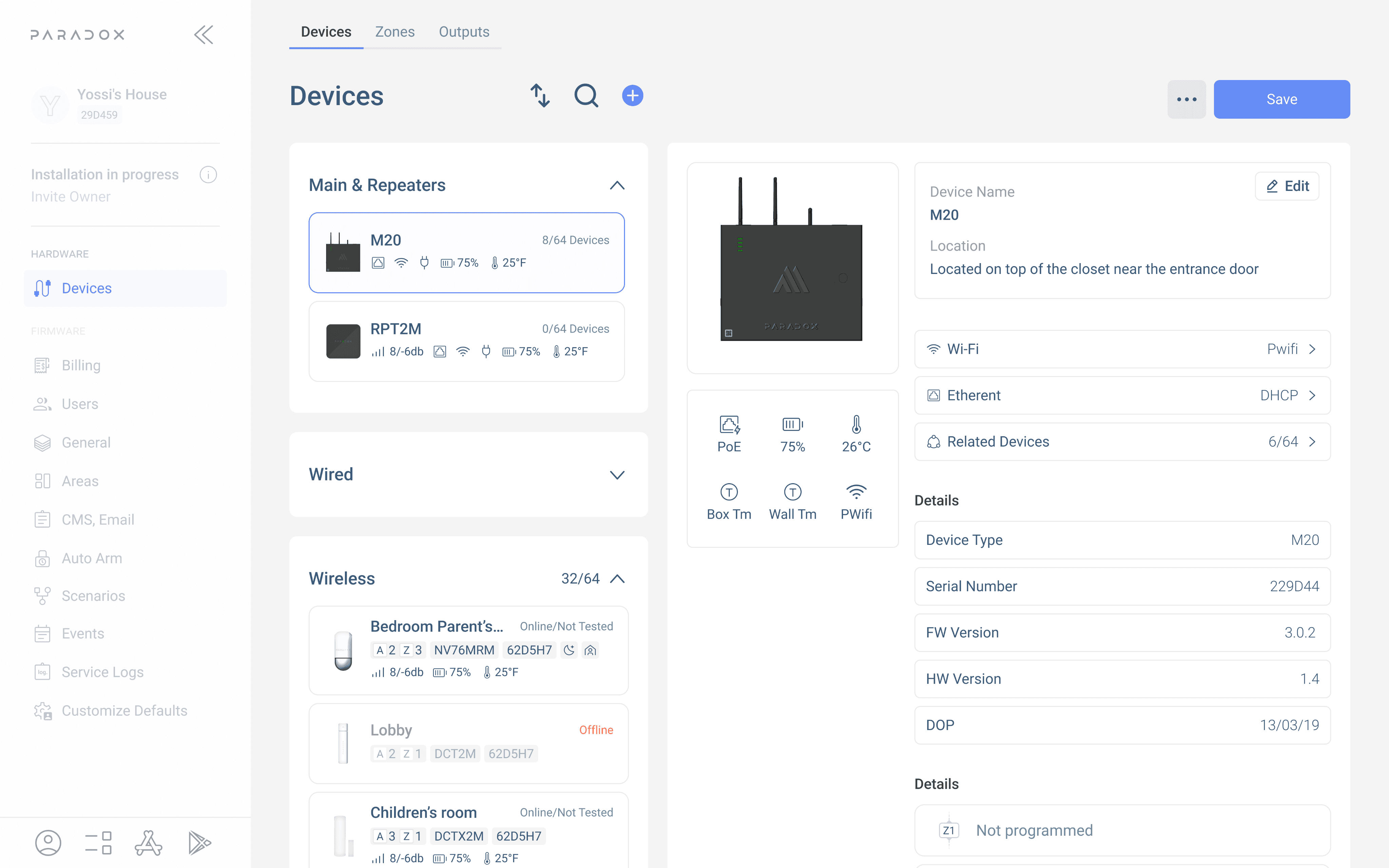
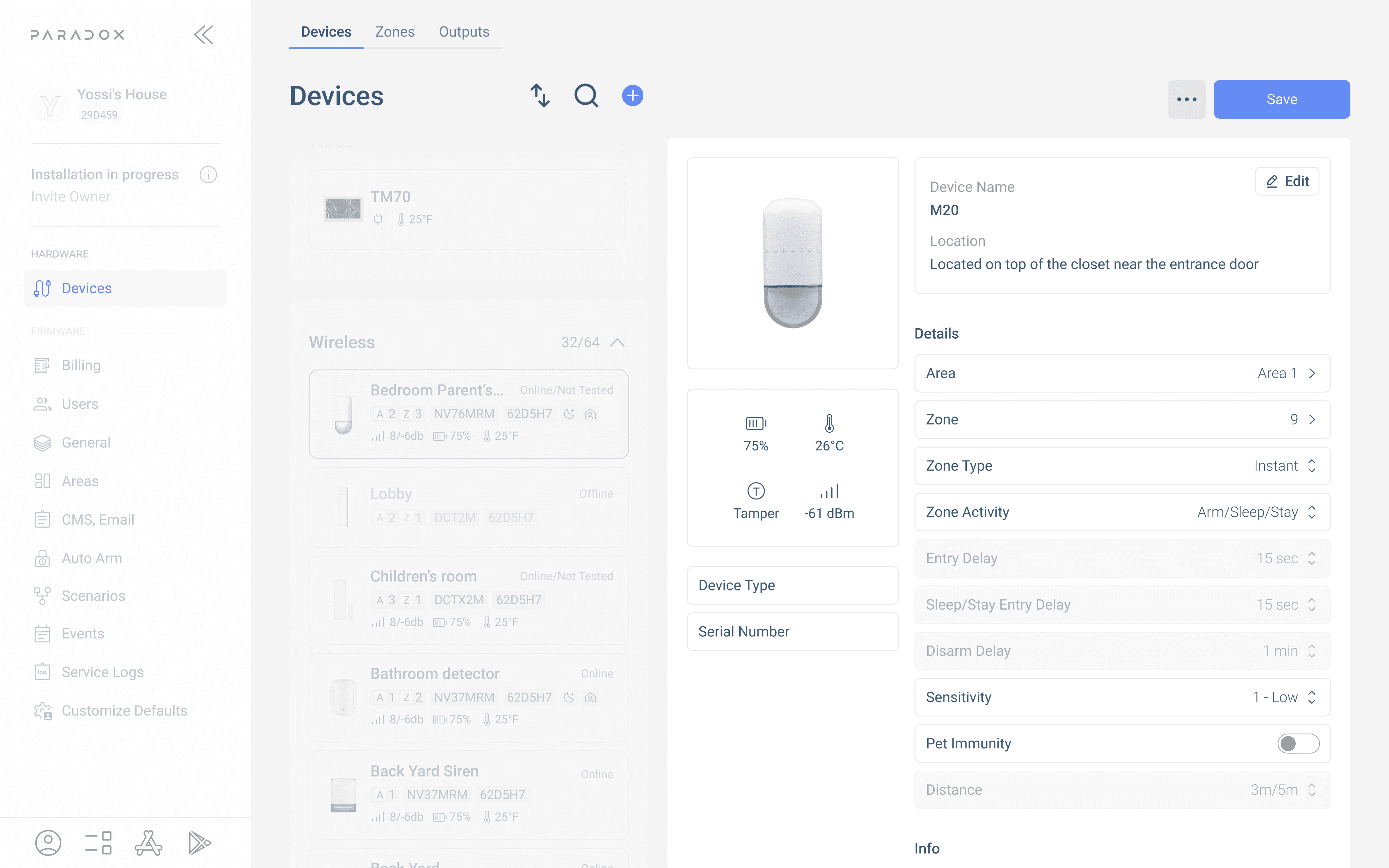
Design a PC version of the existing mobile M Installer app
Support complex multi-zone configurations with wired and wireless devices
Ensure flow clarity for both first-time installers and power users
Maintain UI consistency with mobile while leveraging desktop advantages
CONSTRAINTS
The project started in response to installer feedback: setting up sites on mobile was fast but limited. Complex installs with many zones, sensors, and conditions needed more space, better visibility, and faster navigation.
As the designer on this effort, I adapted mobile flows into scalable desktop layouts. I introduced a clear side-navigation model, persistent feedback for setup steps, and new summaries for zone wiring and connection status. We kept the same step-by-step setup model from mobile—but expanded each step to surface deeper info and controls.
At the same time, I was juggling design system upkeep, QA feedback, and stakeholder alignment—all while M Installer continued to evolve across both platforms. Some ideas didn’t ship but informed future iterations. Others launched fast and instantly improved the install experience.
Today, the PC version is the go-to for installers handling larger or wired sites, where precision and control matter most.

HARDWARE

FIRMWARE


Takeaway & Reflection